Summarize this article with
Mobile Typography: “The text is too small to read”, “The words seem to be a bit distantly placed” – We’ve often heard such comments since user experience established itself as a key element of mobile app design.
Table of Contents
With mobile apps taking a front seat in day-to-day activities, the amount of reading we do on small screens has grown steadily. The mobile-first approach has pushed designers to give typography extra thought. It isn’t a glamorous subject, but it’s an essential part of presenting a clean UI and UX on a limited screen without overload.
Here’s a practical look at mobile typography, updated with current Apple, Google and accessibility guidance, and why getting it right can lower app abandonment.
What exactly is mobile typography?
Typography is the art of styling, formatting and organising written text (typefaces, point sizes, line spacing, letter spacing and line length) so that it’s pleasant, clean and readable. Mobile typography applies those choices to small, touch-driven screens, where users read at arm’s length, often on the move, and can change the system text size themselves.
In short, it covers everything related to the written language visible on the screen and requires both the art and technical skills of the designer.
Why does typography matter in mobile app design?
One of the primary objectives of any mobile design is to hold the user’s interest, and this is where typography plays a vital role. If copy is displayed in a disorderly way, it hurts both UI and UX. Images and videos are dynamic and colourful, but users still rely on text for labels, buttons, prices, errors and instructions.
It’s also an accessibility issue. Many people raise their phone’s default text size, and apps that ignore that setting become hard or impossible to use. Under WCAG 2.2, text should be resizable up to 200% without losing content or function.
Mobile typography rules worth following for a powerful UI
Below are the elements I’d check first when reviewing any app’s text.
1. Choose the font size as per the design context
Font size plays a significant role in mobile typography. Some may think a smaller size works fine on bright, sharp screens, but that’s not true. Small text strains the eyes, and while modern devices allow zooming, it’s not always convenient. Fonts should be big enough to read comfortably but not so big that they overpower other elements.
Platform defaults are a good starting point. Apple’s Human Interface Guidelines use 17 pt as the default body size on iPhone, and Material Design 3 sets its Body Large style at 16 sp on Android. On Android, define text in sp (not dp) so it scales with the user’s font setting.
2. Do not overlook white space
When design elements are tightly bundled together on small screens, the interface looks messy and navigation becomes difficult. Designers need to leave space between components to relieve users’ eyes. Since a phone screen doesn’t allow much room, balancing elements matters even more.
3. Get line height (leading) right
Leading is the spacing between baselines. Older advice suggested about 120% of the font size, which suits headings but feels cramped for paragraphs on a phone. For body text, a line height of roughly 1.4 to 1.5 times the font size reads better, and WCAG’s text-spacing criterion expects layouts to cope when users push it to 1.5. Done right, readers move through lines faster and the copy stays legible.
4. Focus on line length
Line length has a big impact on readability. Desktop line lengths don’t work on mobile, and overly long lines feel tiring. On phones, aim for roughly 30 to 50 characters per line for body text. If lines get much shorter, text becomes choppy; much longer and users lose their place.
5. Stick to built-in text styles
Use built-in text styles whenever possible. They’re based on the system fonts (SF Pro on iOS, Roboto or the device font on Android) and come with tuned tracking and leading for every size. On iOS, built-in styles support Dynamic Type automatically, so text grows and shrinks with the user’s settings.
6. Use responsive typography
Phones, foldables and tablets come in many sizes, so typography must adapt. Wrong sizes, font placement or widths can break the balance of the whole layout. Test with the largest accessibility text sizes and on a small phone, and make sure labels wrap instead of getting cut off.
Contrast, dark mode and font choice
Readable type also needs enough contrast. WCAG asks for at least 4.5:1 between body text and its background (3:1 for large text). In dark mode, avoid pure white text on pure black, which can look harsh, and check that thin font weights don’t disappear.
Variable fonts are worth a look too. One font file can cover many weights and widths, which keeps app size down and makes fine-tuning easier.
| Setting | Practical starting point | Source |
|---|---|---|
| Body text size | 17 pt (iOS), 16 sp (Android) | Apple HIG, Material Design 3 |
| Body line height | About 1.4–1.5× font size | WCAG 2.2 text spacing |
| Line length | About 30–50 characters | Common readability guidance |
| Text contrast | 4.5:1 minimum (3:1 large text) | WCAG 2.2 |
| Text scaling | Works up to 200% | WCAG 2.2 |
Examples of mobile typography in real apps
These screenshots were captured when this article first ran in 2021, so the apps may look different today.
1. FIFA App – Android, iOS
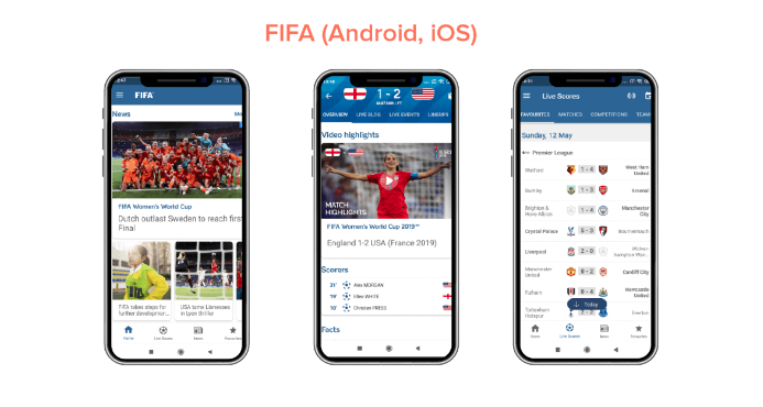
At the time, the FIFA app used a condensed display typeface for headlines and varied its font sizes to emphasise particular content, such as scores and match times.
2. Citroen Lifestyle – iOS
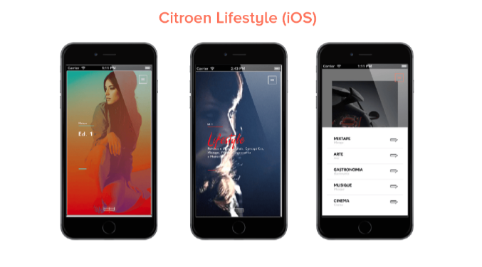
This iOS app focused on font pairing and text-in-picture layouts, showing how type and imagery can work together without hurting readability.
If you design for Apple devices, our guide to iOS UI designing goes deeper, and these tips for improving user experience apply to web layouts too. You’ll find more in our technology section.
Things to remember about mobile typography
- Mobile screens are short of space, so don’t overload them and keep things minimal.
- Test on a smaller screen first, then at the largest accessibility text size.
- Avoid decorative and cursive fonts for body text, since they don’t render well at small sizes.
- Use system text styles and sp units so your app respects user settings.
Every mobile design project is a challenge, and how you apply these rules will shape the result. Did we miss anything important? I’d love to hear from you in the comments section below.