You’ve just finished your latest video and now it’s time for that cool, stylized YouTube banner. You open up Adobe Illustrator or Photoshop to jump into some serious work. You import a stock photo from sxc.hu, add some text effects in the style of the cover art from Inception, add shadows here and there and before you know it, your masterpiece is complete! Now you’re ready to upload your creation into YouTube. But wait! The requested dimensions are different from what you see on other videos in your niche. So, what should you do?I’m going to take a deep breath and say something unpopular: don’t try to make a Youtube banner template that fits every single video.
Why not, you ask? Well, the simple reason is that there are far too many different styles of banners to make a single template that would fit every possible video. So, if you try to make one banner that fits everyone’s video, it’ll end up fitting no one’s video. At Venngage, you can be assured that it is a readily accessible and easy to navigate banner maker for Youtube and also offers a variety of Youtube banner templates that you can start your work on.
Moreover, to help you out, here are 12 elements that you should NOT include in your YouTube banner template:
1. Stock Photos
I cannot begin to tell you how many times I’ve seen stock photos used in YouTube banners. Not only do these look amateurish and unoriginal, but the vast majority of users don’t even download them! When they see them sitting on top of their own cover art or whatever background they chose, there was probably very little positive reaction. Why not use your own custom-made banner art?
If you wish to do your own custom-made banner art, you can try out Venngage, wherein you can find a variety of channel banner templates. Check out this simple yet eye-pleasing Venngage template below:

2. 3D or Distort Effects
If you’ve got the skills to be able to pull off a cool effect like this, that’s great! By all means, knock yourself out. But if you’re going to put it in a template and give it away for free, there’s a good chance someone will try the effect and fail miserably. And then what? They’ll probably be less likely to show the world what they tried but failed at doing. I don’t know about you, but no one wants to see their work displayed as something bad.
3. Animations
Just like with effects, if you know how to do animation right, more power to you. But if it’s in a template, there’s a good chance someone will try the effect and do it wrong. And then what? They’ll be less likely to show everyone their work, which can be displayed as something negative.
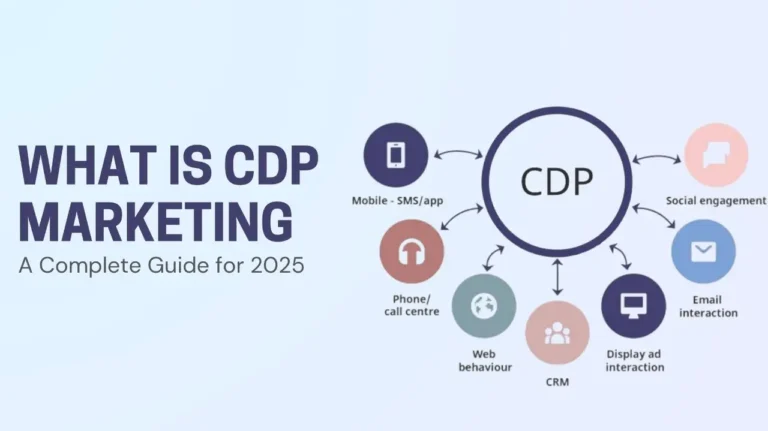
If you are just starting in making one, you can use Venngage — which provides banner maker free for Youtube services. Also, if you wish to include some diagrams on your banner, visit Venngage as there are available diagram templates to work on. Here is a sample diagram template at Venngage that you should check out:

4. Custom-made Cover Art
Remember when I said custom-made cover art is a must? That applies doubly to YouTube banners! People won’t download your banner template because they have their own cover art already. When they see that your banner template uses stock images, 3D or distorted effects, or has animations, they probably won’t want to use it at all. Save yourself some time by not trying to make templates of these types.
At Venngage, you can make Youtube channel art templates from elements that people will actually want to use.
5. One-size-fits-all
I’ve dedicated most of this article so far to explaining why you shouldn’t make one banner template that fits every video, and all the following reasons still apply, to a greater or lesser degree. However, just to be clear: don’t make a single YouTube banner template. You should have at least two templates, for wide and tall videos respectively. This way users can simply create a new project in their editing software and make it as large as they need within those parameters.
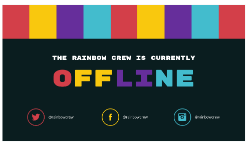
If you are interested, go to Venngage as they offer free Youtube banner services that are available for everyone to use! Below is a Youtube banner template available at Venngage that you might want to try on:
6. Unnecessary Itemized Text
The text on your video will tell people what exactly is happening in the respective video. Why bother putting a redundant text into your banner for Youtube that only tells the user something they already know? It just takes up space and can make your banner look cluttered.
7. Terms of Use
Why include the terms of use for your YouTube channel, website, etc.? You’ll want to put that information on your channel page or profile; not in your banner template. That’s what it’s there for – people will be able to find it if they need to read it. Make sure you don’t include any links to this (like I mistakenly did) because there’s a very good chance someone will click them and be taken away from their video. If they were making a new banner for whatever reason, it’s very likely that the last thing they want to happen is to open up another tab or browser window and have to find their way back.
8. Attribution
“Attribution” means crediting someone for their work. This should be obvious and you shouldn’t post something on YouTube that doesn’t credit the creator(s) of any content that isn’t yours! So why put attribution into your template? You’ll either forget to include it all together, or you’ll simply not do it at all if you’re cutting out unnecessary items for space reasons. It just takes up space and looks unprofessional.
9. Noise
Noise is random high-pitched tones, usually created with sound effects. I can’t think of a good reason to include noise in your YouTube banner template.

10. Really Overused Effects
Do you know that effect where there are lines zipping all over the place? And another one where there’s some kind of rippling water thing going on? If you do, please don’t use it in your template! These types of effects are so overused now that people will probably skip your banner or not even download it because they’ve seen this stuff way too many times before.
11. Distracting Textures/Backgrounds
Sometimes text just shouldn’t go somewhere because the background makes it hard to read. If you can’t read the text, it’s not doing its job. Don’t use backgrounds that are too bright or have too many colors, as well as textures that are distracting, etc.
12. Stock Images
I’ve said this one a lot already, but I’ll say it again: don’t try to make your own cover art if you are not great with it, instead, just pick something from stock images. There are good ones everywhere! Especially on DeviantArt, you can find lots of great images there for free and are assured that they were not stolen.
I hope this article has helped you realize what elements you need to include in your YouTube banner templates and which ones you’d be better off leaving out. This is by no means an exhaustive list — which would be impossible to make, but I hope it has still helped you in some way.
If you are looking for easy-to-use and easy-to-understand software for making your Youtube channel banner, make sure to head on Venngage — a banner maker for Youtube, today to start creating your own!

