
Mobile Typography: “The text is too small to read”, “The words seem to be a bit distantly placed” – We’ve often heard of such comments since the time user experience has established itself as a “key element” of the mobile app design industry.
With mobile applications taking a front seat in day-to-day activities, consuming information on the web and interacting with the words has gradually increased. The mobile-first approach has forced designers to lay additional consideration of typography. However, If your business operates in a specific region, let say the United States, you can consult a mobile app development Chicago company to run a thorough health checkup to find loopholes of designing navigation, and interactiveness that is hindering your mobile experience for your users.
Though it is not a glamorous subject to discuss and debate, it is undoubtedly an essential element present the straightforward UI and UX on the limited screen size without any Overload.
Let’s deep dive into the concept that holds the immense power to lower down the app abandonment rate along with giving a boost in your revenue cycle – And that’s Typography.
First, Let’s Get the Basics Clear
What exactly is typography?
In simple words, Typography is the art of styling, formatting, and organising written texts, line-spaces, point sizes, and other elements in such a way that it leverages a pleasant, clean
and readable user experience. The typography arrangement involves selecting typefaces, line-length, letter-spacing, and adjusting the space between the letters’ pairs.
In short, it involves everything related to the written language visible on the screen and requires both the art and technical skills of the designer.
Why does it matter in mobile app design?
One of the primary objectives of any mobile design is to keep a hold of the user’s interest in the app’s subject. And this is where typography plays a vital role.
Not a single screen can get rid of the redundancy, and if the copy elements are displayed disorderly on the interface, it will negatively impact UI and UX. Though images and videos are dynamic and colourful, the user still needs to gain access through text to acquire information.
Since text conveys things and matters that elements fail to do, it is highly essential to hire the best mobile app development services to take utmost care of the mobile typography and make the interaction more seamless and productive.
Which elements are worth paying attention to build a powerful UI?
Below are some of the elements worth taking care of to build compelling mobile typography.
1. Choose the Font Size as per the design context
In terms of mobile typography, Font size plays a significant role. Though some may think that smaller font size will work best on those bright screens, that’s not true. Using Smaller fonts on the mobile screens hurts users’ eyesight and brings in headache. Though modern devices allow Zooming, it’s not always convenient for users. Fonts in mobile UI should be big enough for users to read and understand but not too big that overpowers other elements.
Appropriate font size is the ultimate key for soothing UX.
2. Do not overlook white space
When design elements are tightly bundled together on small screens, the interface looks messy, and the navigation becomes difficult. Mobile app designers need to give spaces between the components to relieve users’ eyes. Since a mobile app’s size does not allow much white space, it is essential to balance the elements.
3. Keep an eye on leading
Leading is nothing but the spacing between the baselines. Since mobile interfaces are smaller than the desktops, wider or shorter leading may ruin the mobile UI. The ideal leading should be 120% of the font’s point size. If done right, readers go faster through lines, and the copy becomes legible to read.
4. Focus on line length
The length of a text line creates a significant impact on the whole typography. The line length of the desktop screen won’t work on mobile, and too long lines will go beyond the screen borders. Focus on line length is the reason why designers recommend keeping the characters between 30-40 per line. Focused line length will give a boost to the user’s readability.
5. Stick to built-in text styles
Make sure to use built-in text styles as and when possible. Using built-in text styles lets you express the content in distinct and legible ways. By default text styles are generally based on the system fonts. It allows you to leverage the critical typographical features like the dynamic type auto-adjusts tracking and leading for font size.
6. Responsive typography
Since the mobile device has multiple size-chart, responsive typography is highly essential to maintain. Being a vital part of the design responsiveness, wrong size, font placement, and width can significantly impact the entire composition. The minute changes which aren’t significant to consider can break the balance between the design elements. Mobile designers need to consider these aspects for multiple screen sizes to avoid unnecessarily misfortunes in the future.
Let’s have a look over the application that has amazed users with its jaw-dropping mobile design system typography.
1. FIFA App – Android, iOS
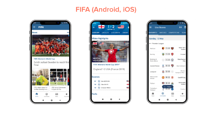
The FIFA mobile app has used Miso for typography in UI design. Though they have used different font sizes, they worked hard to emphasise particular content elements.
2. Citroen Lifestyle – iOS
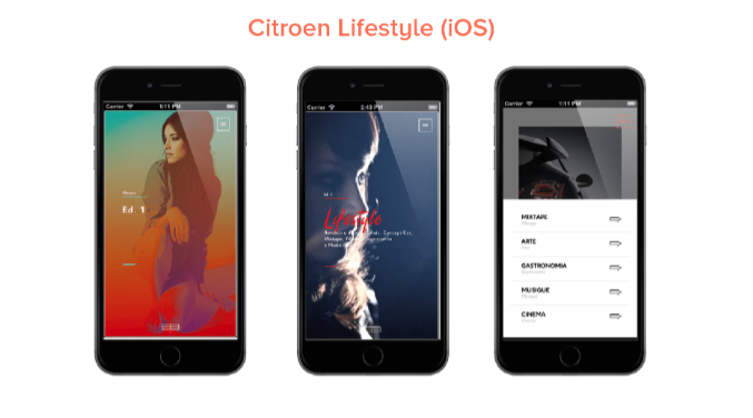
It is another fantastic iOS application that focuses on building design with an idea of font pairing and text-in-picture and other few ways to implement typography in the app design.
Things to remember!
Mobile screens are short of space so do not overload them and keep things to Minimal.
Since mobile screens have various sizes, test your design on a smaller screen first before jumping to bigger sizes.
Avoid decorative and cursive fonts as they do not render appropriately on screens. Make sure the text is legible and easy for users to read.
Every mobile design project is a challenge, and it depends on you how to implement your knowledge to gain the best results.
Did we miss out on anything important? I’d love to hear back more from you in the comments section below.
Also read: Why Do Schools Need a Mobile Application