
The design elements of a website is an indicator of the professionalism of that brand. If a website is designed well, it can positively affect user behavior and enhance your brand reputation. But, if you don’t stress upon it, you can lose your customer to a competitor’s website.
To make sure it doesn’t happen to you, we have mentioned 10 important aspects of website design that you should consider for your ecommerce site.
10 Website Design Elements You Should Know
Below we have added 10 ideas about website design that can help boost your e-store sales.
- Stress on your homepage
- Keep things simple
- Keep the interface easy to understand
- Understand colors
- Work on the CTA
- Use customer names
- One-click check out
- Add a “view cart” button
- Use high-quality product images
- Highlight social media pages
Now let’s take an overview of the above points:
1. Stress on your homepage
When you go out shopping, the presentation of a shop is what attracts you at first. If it looks old, unmaintained, and dull, you don’t feel like even entering it, let alone buying from it. The same goes for online stores.
If the homepage is presented in a unique, beautiful, and professional manner, it attracts more customers. The website needs to be relatable and as a store owner, you need to choose wisely what to display at the front and how.
If you want external help, you can look into companies of ecommerce web design Dubai, Pakistan, India, or the Philippines. These regions offer high-quality web and software design services at great prices.
2. Keep things simple
While tacky colors and bold fonts may look fun in some places, keeping things simple most of the time can work out well. Most popular brands keep their websites simple, to the point, and clear to avoid unnecessary distractions.
If you fill your website with bells, whistles, ads, and banners, it will look so cluttered and spammy that the customer won’t be able to understand your brand, and what it’s trying to sell. That’s the last thing you want to happen!
3. Keep the interface easy to understand
We cannot empathize enough on the fact the user experience is key to improved sales. If your site loads faster, is easier to navigate, isn’t cluttered, and makes purchases easy, it helps the customer in shopping faster.
Another thing to work on is mobile optimization. As many users browse the internet through their phones, it’s great to develop a site compatible with mobiles.
4. Understand colors
Colors seem like a matter of preference and choice, but in reality, they have a whole science behind them. Certain colors provoke certain feelings. So depending on your brand and your products you can design your website.
According to CXL, making the purchase button red can improve sales by up to 34%. The red color increases the feeling of passion and excitement. Thus, keeping a red button for purchases can improve customer anticipation and your sales in return.
5. Work on the CTA
Have you ever bought a product after seeing a limited-time offer CTA (call to action)? If so, you must know the urgency they create and how they inform customers about the best deals and discounts available at your store.
CTAs are signals that appear on websites and make the customer take action. The action may be to comment, like a post, rate a product, view a new collection, get a limited discount offer, etc. When you make use of it effectively, you can get more engagement and conversions. Try to place it in bold colors so it pops up from the background and becomes more visible.
6. Use customer names
Once someone uses your name to address you, you feel more inclined to reply to them. The same happens with websites. If you add a name feature in the sign up options and then address customers by their names, they will feel more connected to your brand.
You can also introduce dashboards for each customer with their names so they feel more attached to that space on your website.
7. One-click check out
Sometimes, it’s the minute details that matter the most.
Every website nowadays provides add-to-cart options where you add items and then move to payment and then fill in your details. But, to make purchases even easier, you can introduce a “One- Click” checkout button so you can quickly proceed to payments and skip the “Add to cart” step.
Amazon reportedly got a 10x better response after using the “One- Click” check out button.
8. Add a “view cart” button
As customers add products to their carts, they want to edit, add and remove items as well. If they add a product accidentally and want to remove it, going to another page and then coming back to the product page would seem annoying.
On the other hand, if you keep a “View Cart” button on the top, they can easily view what they added and remove products without leaving the current page. This small step can greatly improve sales as it promotes customer convenience.
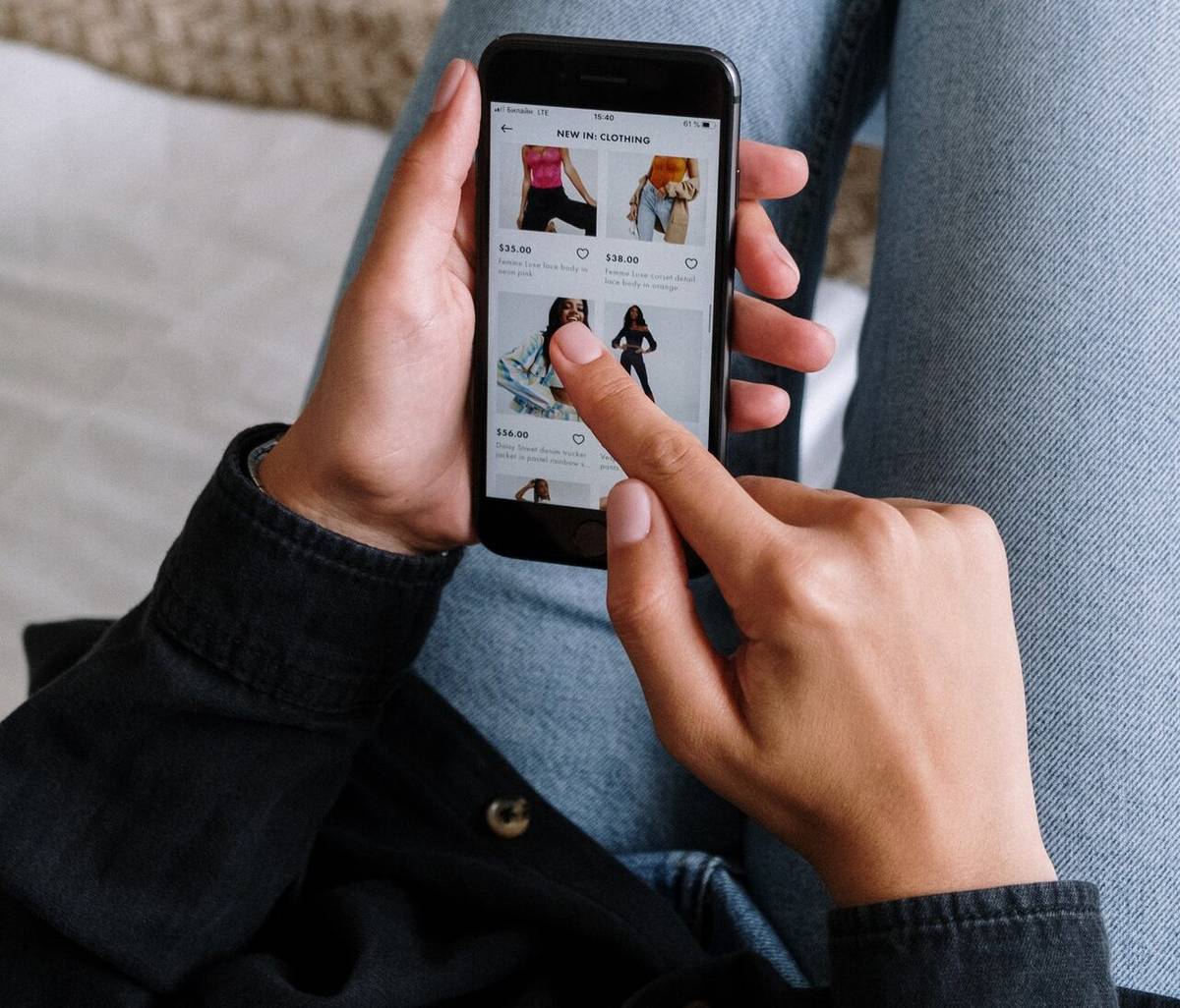
9. Use high-quality product images
According to a case study by VWO, conversions increase more than 40% if relevant images are added to a website. So when you are adding product images make sure they are clear, relevant, and high quality. If you add a 3D view or videos, that will further build trust and will make your products more desirable.
Plus, make sure to add original and professionally taken photos as that will help the SEO (search engine optimization) of your site.
10. Highlight social media pages
Social media has become extremely powerful over the years. It is a way to connect to a wider audience and get to know them better, at a personal level. As an online store owner, you should make sure that your brand has a strong presence on social media and that your profile links are shared on your website.
Add profile links on each page so customers can click them conveniently.
Conclusion
In this article, we mentioned 10 areas within web design that can boost your brand sales. While you are planning the design, keep things simple and understandable. Make sure to have a catchy homepage that the customer can relate to.
To communicate offers and to engage the audience use CTAs with bold colors. Address customers by their names and keep the website intuitive.
Add high-quality images, a “view cart button” and “one-click” checkouts to make shopping easier. Lastly, make sure to add social media links to all the pages of your website to stay connected to your audience.
Read also: Build an Ecommerce Website that Users Love: Essential Features