
Data visualization is a method for transforming raw data into visual forms, including charts, graphs, and maps. It allows you to understand key insights effortlessly.
There are tons of libraries available for creating the JavaScript chart. However, not all of them can create compelling visualizations.
As a result, it becomes difficult for users to understand key insights. That’s why you need to follow data visualization best practices. It will help you create compelling charts and graphs for your dashboard.
In this post, you will learn about the best visualization practices and using a JavaScript chart. Also, you will find the best charting libraries and code examples. Let’s dive in.
What Are The Best Practices For Data Visualizations?
There are numerous data visualization best practices for making the most out of the datasets. Here, you will find 7 of the most important ones.
Identify Your Target Audience
It’s essential to identify the target audience. Without it, you cannot create compelling visualizations. Examples of the potential target audience include marketers, business executives, and entrepreneurs.
Identifying the target audience can help you in different ways. For instance, it enables you to understand their pain points and needs.
You can experiment with various techniques and methods to make the data understandable. Hence, you can create compelling visualizations that can easily communicate with the audience.
Ensure That Your Data Is Clean
You need to clean raw data before converting it into a chart. Otherwise, you won’t be able to filter out any anomalies. It will result in inaccurate visualization.
That’s why you must perform data cleaning. It will filter out all anomalies or inaccuracies within your data.
According to a New York Times survey, data scientists spend 50 to 80% of their time cleaning and organizing data. And they do it before visualizing the information. It enables them to generate accurate data visualization.
Nobody likes to see misleading insights. With data cleaning, you can provide the audience with reliable and accurate information.
Choose The Right Chart And Graph
Choosing the correct chart and graph is very important. It helps you effectively tell the story and answer critical questions generated by data. But more importantly, it enables you to present key insights accurately.
Choosing the wrong chart type can generate inaccurate results. You don’t want your visualization to deliver misleading insights.
That’s why you must know how to choose the right charts and graphs.
For example, the bar chart will be the right choice if you have to compare categories within a single measure. On the other hand, a heatmap will be the best option for visualizing location-specific questions.
Use Contextual Clues
The contextual clue is another crucial factor. It helps you to decipher information quickly. Hence, you don’t have to spend time scrutinizing it. You can use different shapes rather than bar charts or line graphs to tell compelling stories.
For example, you are working on visualizing data for endangered species. The audience can quickly identify the most vulnerable animals using different shapes with different colors, like green, yellow, and red.
Because it provides them with contextual clues. You can’t do the same thing with typical bar charts or line graphs.
Find The Right Visualization Tool
You must pick up the right visualization tool. Otherwise, you will be in a lot of trouble. User-friendly tools, like FusionCharts, enable you to visualize the data in minutes. But choosing a complicated tool will make things very difficult.
You don’t want to spend hours simply creating charts or graphs. You need a tool that is fast, powerful, and very easy to use. It will significantly boost your workflow. But more importantly, it will make your life a lot easier.
What Are The 5 Best Tools For Data Visualization?
1. FusionCharts
FusionCharts is the most comprehensive JavaScript library on the market. It supports over 100 interactive charts and over 2,000 data-driven maps. It has the best-looking charts in the industry. By utilizing them, you can create stunning data visualizations.
FusionCharts is very easy to use. You just need to write a few lines of code to build visualizations. Also, it has comprehensive documentation. Besides, it supports many code examples following the best data visualization practices. By utilizing them, you can effortlessly incorporate beautiful charts and graphs into your dashboard.
2. Highcharts
Highcharts is a popular JavaScript library. It allows you to create reliable and secure data visualizations. It is based on SVG with fallbacks to VML and Canvas for old browsers. Hence, it supports older browsers, including Internet Explorer 6.
Also, Highcharts is compatible with all modern browsers, including Chrome, Safari, and Firefox. Therefore, you will never face any compatibility issues. Besides, Highcharts is more than just a simple graph builder.
It enables you to create various advanced charts, including Gantt charts, map-based charts, and stock charts.
3. AMCharts
AMCharts is a JavaScript charting library. It allows users to customize their data display. It offers a variety of data visualizations, including dynamically adjustable bar, line, and pie charts. Also, it provides gauges, maps, data tables, timelines, and dashboards.
AMCharts provides chart examples following the best practices of data visualization. Examples include both TypeScript/ES6 and Vanilla JS.
Also, the documentation is very user-friendly. It explains everything in detail. Besides, AMCharts is versatile. For example, you can use it on front-end and server-side data rendering on Node.js servers.
4. Chart.js
Chart.js is an open-source JavaScript library. It allows you to create simple visualizations, including line charts and bar graphs.
Also, it lets you easily alter and animate the visuals. Besides, all the charts are responsive. Hence, you can display them on all modern devices without any hassle.
Chart.js doesn’t require a deep understanding of data science techniques. It has a simpler learning curve. Therefore, you can quickly get started with it. Also, the documentation is intuitive. You will have no issue following it.
5. D3.js
D3.js is a powerful JavaScript library. It allows you to create custom visualizations using SVG, HTML, and CSS. You can build visualizations the way you want.
D3.js has a steep learning curve. You will need some time to get used to it. Also, its documentation can be confusing. Nonetheless, D3.js combines sophisticated visualization components with data-driven manipulation.
Also, it offers hundreds of code samples. Besides, it supports the drag-and-drop feature. As a result, D3.js has become massively popular among developers worldwide.
What Are Some Example Charts That Follow Data Visualization Best Practices?
Bar Chart
A bar chart allows you to represent qualitative information. You can use it to compare different data. Here is an example:
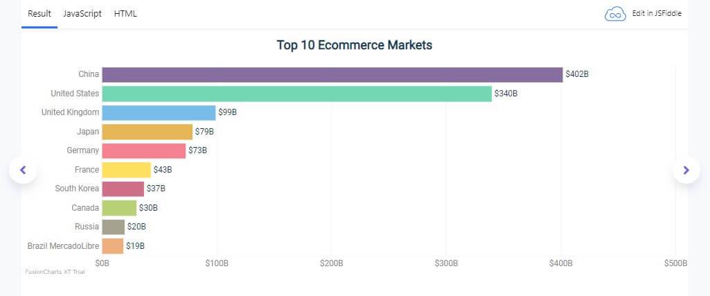
As you can see, the bar chart compares the world’s top 10 eCommerce markets. To build it with FusionCharts, you need to follow these steps:
1. Go to your HTML file. Create a container, called chart-container. Here, FusionCharts will render the bar chart.
| <!– Simple implementation of the Bar 2D chart –> <link href=”https://fonts.googleapis.com/css?family=Roboto” rel=”stylesheet”> <div id=”chart-container”>FusionCharts will render here</div> |
2. Go to your JavaScript file. Add these lines:
| FusionCharts.ready(function () { var topStores = new FusionCharts({ type: ‘bar2D’, renderAt: ‘chart-container’, width: ‘100%’, height: ‘400’, dataFormat: ‘json’, dataSource: { “chart”: { “caption”: “Top 10 Ecommerce Markets”, “numberPrefix”: “$”, “numberSuffix”: “B”, “placeValuesInside”: “0”, “showAxisLines”: “1”, “axisLineAlpha”: “25”, “alignCaptionWithCanvas”: “0”, “showAlternateVGridColor”: “0”, “theme”:”hulk-light” }, “data”: [ { “label”: “China”, “value”: “402” }, { “label”: “United States”, “value”: “340” }, { “label”: “United Kingdom”, “value”: “99” }, { “label”: “Japan”, “value”: “79” }, { “label”: “Germany”, “value”: “73” }, { “label”: “France”, “value”: “43” }, { “label”: “South Korea”, “value”: “37” }, { “label”: “Canada”, “value”: “30” }, { “label”: “Russia”, “value”: “20” }, { “label”: “Brazil MercadoLibre”, “value”: “19” } ] } }) .render(); }); |
That’s it. You have managed to create the bar chart with just two simple steps.
Line Chart
A line chart represents continuous data over a continuous period. It is beneficial for revealing trends and relationships in data. Here is an example:
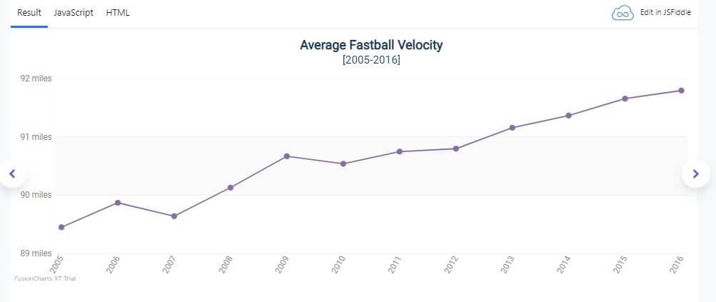
As you can see, the line chart shows the average fastball velocity in terms of years. Looking at it, you will find that the velocity usually increases with the year. To create this line chart with FusionCharts, you have to follow these simple steps:
1. Create a container for displaying the line chart in your HTML file.
| <link href=”https://fonts.googleapis.com/css?family=Roboto” rel=”stylesheet”> <div id=”chart-container”>FusionCharts will render here</div> |
2. Then open your JavaScript file and insert these lines:
| FusionCharts.ready(function() { var avgBallChart = new FusionCharts({ type: ‘line’, renderAt: ‘chart-container’, width: ‘100%’, height: ‘400’, dataFormat: ‘json’, dataSource: { “chart”: { “caption”: “Average Fastball Velocity”, “subCaption”: “[2005-2016]”, “numberSuffix”: ” miles”, “showValues”: “0”, “rotateLabels”: “1”, “slantLabels”: “1”, “showHoverEffect”: “1”, “canvasPadding”: “10”, “yaxisminvalue”: “89”, “showaxislines”: “1”, “anchorRadius”: “4”, “anchorBgColor”: “#876EA1”, “anchorHoverRadius”: “8”, “theme”: “hulk-light”, }, “data”: [{ “label”: “2005”, “value”: “89.45” }, { “label”: “2006”, “value”: “89.87” }, { “label”: “2007”, “value”: “89.64” }, { “label”: “2008”, “value”: “90.13” }, { “label”: “2009”, “value”: “90.67” }, { “label”: “2010”, “value”: “90.54” }, { “label”: “2011”, “value”: “90.75” }, { “label”: “2012”, “value”: “90.8” }, { “label”: “2013”, “value”: “91.16” }, { “label”: “2014”, “value”: “91.37” }, { “label”: “2015”, “value”: “91.66” }, { “label”: “2016”, “value”: “91.8” }, ] } }).render(); }); |
That’s how you create a line chart with FusionCharts.
Area Chart
The area chart shows the trend over time. Business professionals widely use them for making key decisions. Here is an example:
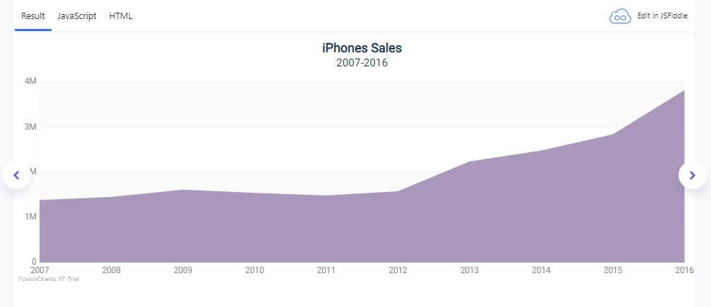
The area chart shows iPhone sales from 2007-2016. To create it using FusionCharts, you have to follow these steps:
1. Open your HTML file and create a container for the line chart.
| <link href=”https://fonts.googleapis.com/css?family=Roboto” rel=”stylesheet”> <div id=”chart-container”>FusionCharts will render here</div> |
2. Go to your JavaScript file. Add these lines:
| FusionCharts.ready(function() { var salesChart = new FusionCharts({ type: ‘area2D’, renderAt: ‘chart-container’, width: ‘100%’, height: ‘400’, dataFormat: ‘json’, dataSource: { “chart”: { “caption”: “iPhones Sales”, “subCaption”: “2007-2016”, “legendPosition”:”Right”, “drawAnchors”:”0″, “showValues”:”0″, “plottooltext”: “<b>Year: $label</b>{br}<b>Sale: $value unit</b></div>”, “theme”: “hulk-light” }, “data”: [{ “label”: “2007”, “value”: “1380000” }, { “label”: “2008”, “value”: “1450000” }, { “label”: “2009”, “value”: “1610000” }, { “label”: “2010”, “value”: “1540000” }, { “label”: “2011”, “value”: “1480000” }, { “label”: “2012”, “value”: “1573000” }, { “label”: “2013”, “value”: “2232000” }, { “label”: “2014”, “value”: “2476000” }, { “label”: “2015”, “value”: “2832000” }, { “label”: “2016”, “value”: “3808000” }, ] } }).render(); }); |
Also read more: How Data Visualization Can Help Boost Your Return on Investment (ROI)