

Summarize this article with
Most logo design mistakes aren’t about bad taste. They’re about skipped steps: no research, no testing, no trademark check. I’ve made a few of these on my own sites, and fixing them later always costs more than getting them right the first time. Here’s what to avoid, and the quick fix for each one.
Although many companies and entrepreneurs do not give it the importance it deserves, the logo is an important element in a business. The logo is the visual representation of what your company means, identifies it, and differentiates it from others. A good logo speaks of your professionalism and your values, which generates trust between the company and the client. When designing a logo, however, there are certain mistakes to avoid. Whether it’s the color, the design, the size, or the concept it represents, a bad logo won’t attract customers.
Table of Contents
Logo Design Mistakes at a Glance
| Mistake | Quick fix |
|---|---|
| 1. Letting a beginner design it | Follow a real process, or hire a pro |
| 2. Copying other logos | Study rivals to find the gap, not to borrow |
| 3. Misusing fonts, color, and effects | One or two fonts, one to three colors, no effects |
| 4. Ignoring where the logo will be used | Export vector files and test small sizes |
| 5. Following trends | Design for 10 years, not this season |
| 6. Buying predesigned logos | Customize heavily or start from your own sketch |
| 7. No clear concept | Write a one-page brief first |
| 8. Skipping the trademark search | Search official databases before launch |
| 9. Shipping raw AI output | Use AI for ideas, refine by hand |
| 10. Never testing the logo | Black and white, 32×32 and circle-crop checks |
The Main Mistakes To Avoid Are These Two:
1. Let Your Logo Be Designed By A Beginner
And by beginner, I mean, for example, your neighbor, the shoemaker whose hobby is to retouch photos and make posters for the neighborhood meeting with his computer; Or your cousin, the engineer who took a 15-hour Photoshop course while unemployed; even the neighborhood printing company, which is going to charge you to make the logo, but they don’t have a designer hired.
These are several examples, but we all have someone we know with basic knowledge of a design program who tries to work as a designer and offers to do this type of work for free or for a minimal price. The problem with these people is that they do not have knowledge of design theory, nor do they have the vision that a professional who is dedicated to this would have. No matter how good faith they put into designing a logo, you can tell from a distance that it is made by a beginner because they make most of the conceptual errors, and in a way that I will explain to you below.
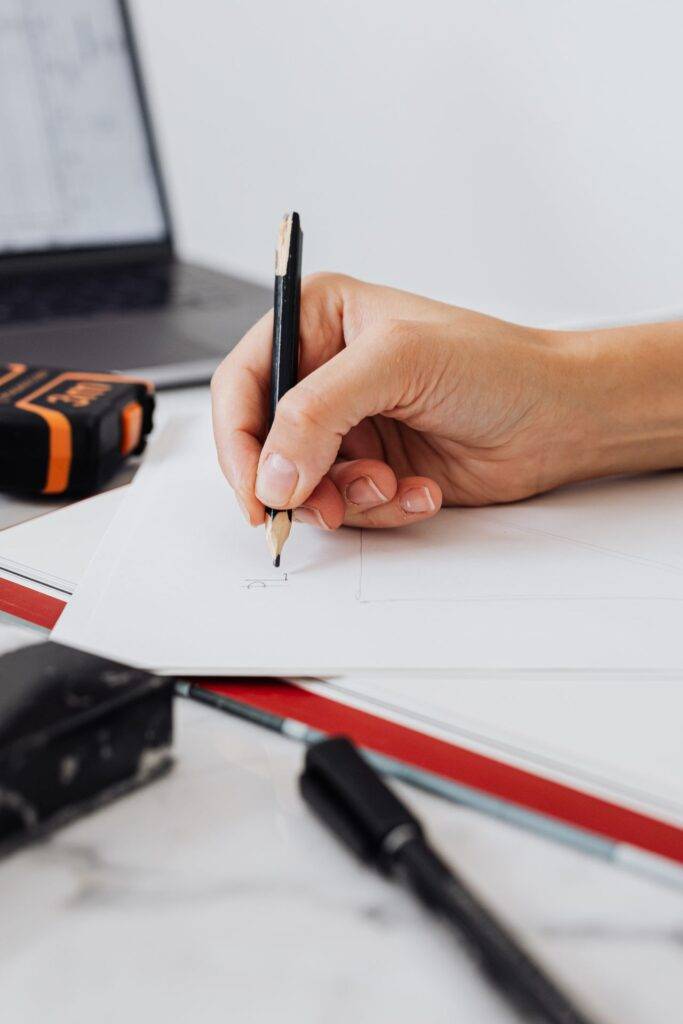
And what if your logo looks like it was made by a beginner? Well, you are not going to attract the customers your company needs. Your clients will be your neighbors, who know who made the logo, or your uncles and cousins, who are very proud of the work of their family members. You will not reach a wider audience. Because? Because the image you give is that of a beginner, someone who is looking for something cheap and unprofessional. And consequently, your business looks cheap and unprofessional.
That said, DIY isn’t automatically a mistake. If you’re pre-revenue, a careful DIY logo can work fine, as long as you follow a proper process instead of winging it. Our How to Make a Logo Design guide walks you through every step, from brief to export files.
2. Copy Other Logos
Unfortunately, this is something that has been done since the beginning of time, and it is quite damaging.
If your logo represents your values and your company, it must be unique, and it must differentiate you from other businesses. For this reason, copying another logo, whether for personal tastes or competition, does not favor the company or the designer in any way.
Looking at competitors is still useful, just for the opposite reason. Screenshot 10 to 15 logos from your niche and look for the color, icon, and font style everyone shares. Then go the other way. If every rival is blue with an upward arrow, a blue arrow makes you invisible. For more ideas, see our guide on how to make your logo stand out.
The Most Common Form Errors That Will Influence The Visibility Of Your Logo:
3. The Incorrect Use Of Typography, Color, And Special Effects
When you start designing a logo, it is very easy to be overwhelmed by the many possibilities offered by current design programs and all the free resources at your fingertips. Thousands of fonts, color effects, gradients, 3D effects, watercolor, glitter, etc. All this is very good, but you have to avoid using all these resources at the same time.
Here are some examples of the most common mistakes that make a logo difficult to read:
3.1. Use multiple fonts at the same time
Stick to one typeface, two at most. Three or more fonts in a logo read like a ransom note, and none of them gets a chance to build recognition.
3.2. Use the wrong typeface
Fonts carry personality before anyone reads a word. A playful script on a law firm or a stiff serif on a kids’ brand sends the wrong message. Also check the license, since many “free” fonts are free for personal use only, and your logo is for commercial use.
3.3. Create the shape with color
If the logo only makes sense because of its colors, it will fall apart on a one-color receipt or an embroidered cap. When I tested logos this way, the ones built on color splits turned into shapeless blobs in pure black. Build the shape first in black and white, then add color.
3.4. Abuse special effects
Gradients, drop shadows, glows, and 3D bevels die in one-color printing and blur at small sizes. If you remove an effect and the logo still works, leave it out.
4. Not Taking Into Account The Different Uses That The Logo Will Have
When designing a logo, it must be taken into account that it will not only be used to put it on your business cards, but that it must be optimized for use in different media and formats.
For example, the same file will not be used to print an advertising brochure and to create your website. In the first case, you should use your logo in a vector file or a file with a high resolution so that the image has enough quality and does not get corrupted (it looks pixelated). In the second case, you have to use a lower-quality image so that it takes up little space and is much smaller in size.
This means that:
4.1. You need to have the logo in several file formats so that it can adapt to different formats without losing the quality of the image.
4.2. You need to take into account how your logo will look in different sizes to make sure it can be seen correctly. For this reason, it is advisable to avoid very complex shapes since they will not be seen correctly in very small sizes.
Here’s the basic file kit every logo needs:
| File | Use it for |
|---|---|
| SVG | Websites and apps (stays sharp at any size) |
| AI / EPS / PDF | Printers, sign makers, and merch suppliers |
| Transparent PNG | Social media, slides and documents |
| Square PNG / ICO | Favicons |
If a logo maker only gives you a JPG, you own a picture of a logo, not a usable one.
5. Be Inspired By Current Trends
An important detail when designing a logo is thinking ahead. It is about creating a unique image that is capable of lasting over time.
Fashions change faster every day. You just have to go around Pinterest to realize it. If you create your logo based on what is currently being worn, it probably won’t take long for it to go out of style.
A simple test: would your logo have looked fine 10 years ago? If it depends on this year’s font, a glitch effect, or a heavy gradient, it will look dated long before you’re ready to redesign it.
The Most Common Misconceptions That Will Influence The Visibility Of Your Logo:
6. The Use Of Predesigned Logos
Yes, there are predesigned logos. There are pages where, for a small fee, you can buy an already created logo, add your company name, and voila! You already have a logo. This practice is strongly discouraged for several reasons:
6.1. Your logo will not be unique or original. The same logo that you bought may be used by hundreds of other businesses.
6.2. The concept of your logo has not been created exclusively for your business, so it is to be imagined that it does not define you 100% but rather gives an approximate image of what you do.
The same goes for free templates in tools like Canva: thousands of people start from the same design. If you use one, change the icon, the layout, and the colors until it no longer looks like the template. Our guide to making free logos for your business shows how to do that without falling into this trap.
7. Not Having A Clear Concept Of What You Want To Convey
Before taking the pencil and starting to sketch, we must be clear about what we want the image we are going to create to convey. For this, there are two important steps that must be taken into account:
7.1. Investigate. This step is essential for ideas to emerge. By studying the sector in which the company is dedicated in a general way and looking at the logos of the competition, you have to know the terrain in which we operate.
7.2. Involve the customer. As important as, or more important than, knowing the competition is knowing what the business values are and if it offers any added value. This will give us the clues to create a unique and memorable image.
The easiest way to do both is a one-page brief: what the business does in one sentence, who it’s for, three to five personality words, and every place the logo will appear. In my experience, a logo with a written brief behind it needs far fewer revision rounds.
3 More Logo Design Mistakes to Avoid in 2026
8. Skipping the Trademark Search
Before you print anything, check that your logo isn’t too close to a registered mark. Search the USPTO Trademark Search for the US, the WIPO Global Brand Database for international marks, and IP India’s public search for India. It takes an hour and is far cheaper than a forced rebrand.
9. Shipping Raw AI Output
AI logo generators are great for exploring ideas, but the raw output is risky. The US Copyright Office’s 2025 AI report says prompts alone don’t make you the author, though human edits and arrangements can earn protection. Generators can also produce look-alikes of existing logos. Treat AI output as a sketch and refine it by hand.
10. Never Test the Logo
This is the quick check I run before calling any logo finished:
- Black and white: Does it still work in pure black on white, then white on black?
- Small size: Is it readable at 32×32, about the size of a browser tab?
- Circle crop: Does it survive being cropped into a round social media avatar?
- Real people: Can someone from your target audience describe it after a three-second look?
I noticed most logos fail at least one of these on the first try, and that’s fine. It’s much easier to fix them now than after launch.
In Short
Avoiding the previous errors, you will get a logo:
- that is unique and original
- that is legible and easily recognizable
- that withstands the passage of time
- that does not deform when reproduced on different media
- that is professional.