

Summarize this article with
Learning how to make a logo design isn’t about paying for expensive design software. It’s creating an identity that works at any size, whether it’s a 16px favicon, a paper receipt, or a circle-cropped Instagram profile picture. Here, I cover the entire process from brand brief to export package for founders, freelancers, and side-hustlers designing their own logo. I’ve applied every one of the tests below to my own sites’ logos, and included a checklist at the bottom so you can tell when you can stop.
Table of Contents
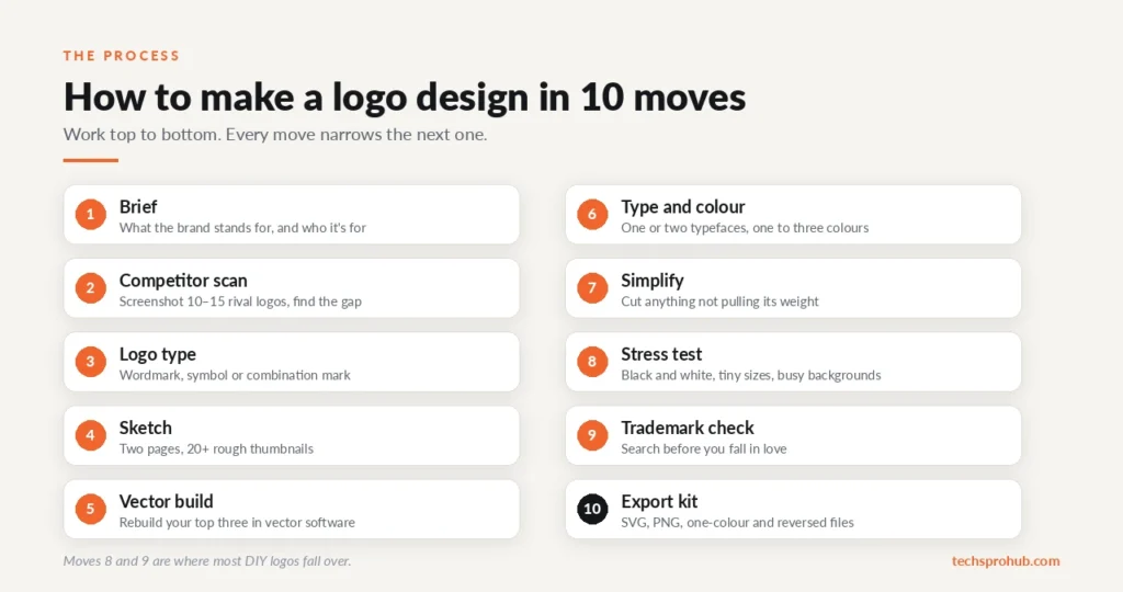
How to Make a Logo Design in 10 Moves
| Move | What you do |
|---|---|
| 1. Brief | Write what the brand stands for and who it’s for |
| 2. Competitor scan | Screenshot 10–15 rival logos and find the gap |
| 3. Logo type | Pick a wordmark, symbol or combination mark |
| 4. Sketch | Fill two pages with 20+ rough thumbnails |
| 5. Vector build | Rebuild your top three in vector software |
| 6. Type and color | One or two typefaces, one to three colors |
| 7. Simplify | Cut anything that isn’t pulling its weight |
| 8. Stress test | Black and white, tiny sizes, busy backgrounds |
| 9. Trademark check | Search before you fall in love |
| 10. Export kit | SVG, PNG, one-color and reversed files |
What Is a Logo?
A logo is a visual mark that allows people to identify a business, product, organization, or creator. This mark can take many forms, such as a wordmark, a symbol, a lettermark, a combination mark, or any other visual treatment.
A logo isn’t your entire identity. Logos are one piece of a much larger puzzle. Your brand is also made up of colors, typography, messaging, photography, and packaging that enhance the logo and create a consistent identity.
What Makes a Logo Memorable?
A memorable logo reads at a glance, stands apart from rivals, fits the brand, works in one color, and still looks fine 10 years from now.
What’s the catch? People don’t remember logos in detail. According to the Signs.com experiment, Branded in Memory, which asked 156 Americans to sketch out 10 iconic logos from memory, only 20% drew Apple’s logo almost perfectly, and almost one-third added a stalk that isn’t there. The one thing most people got right: colors (roughly 80%).
Design for the blurry version your customers carry around. A clean silhouette and a signature color do the heavy lifting. Fine details are a bonus.
The logo should also communicate without a paragraph of explanation. Its shape, typography, and visual system should be distinctive enough that people recognize it after a glance.
My First Step: A One-Page Logo Brief
Every logo decision gets easier once you know what you’re trying to say.
Write down four answers:
- What you do, in one sentence.
- Who it’s for. A sneakerhead brand and an accounting firm shouldn’t look like cousins.
- 3 to 5 personality words, like “calm, premium, precise” or “loud, playful, fast.”
- Where the logo will live: website header, app icon, Instagram avatar, packaging, merch, invoices.
A logo embroidered on a cap needs chunkier shapes than one living only in a website header.
Coordinate with the brand as well. Your logo should feel at home on your website, packaging, and social profiles. It doesn’t have to use all the colors or visual elements of the brand, but it should be part of the same visual system.
Study Competitors (So You Don’t Look Like Them)
Research your particular space, take a screenshot of 10 to 15 competitor logos, and compare them side by side. Look for trends: the common color, icon, shapes, and font style used.
Then walk in the other direction. If every fintech in the space is blue with a rising arrow, a blue rising arrow makes you invisible. For more ways to break from the pack, see these tips to make your logo stand out.
Pick the Right Logo Type
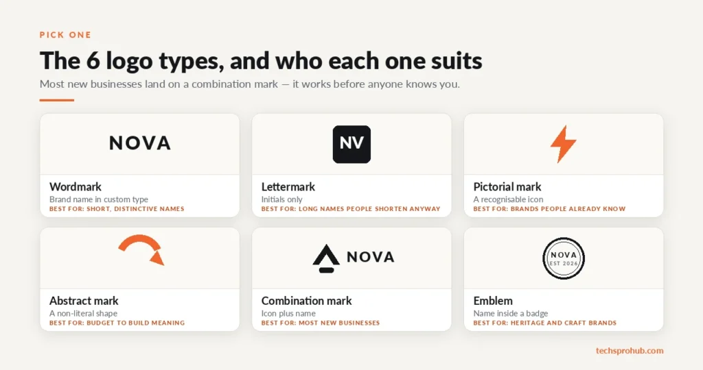
There are six common logo types worth knowing. The right pick depends on your name and how much time you have to build recognition.
| Logo type | What it is | Example | Best for |
|---|---|---|---|
| Wordmark | Brand name in custom type | Google, Coca-Cola | Short, distinctive names |
| Lettermark | Initials only | IBM, HBO | Long names people already shorten |
| Pictorial mark | A recognizable icon | Apple, X | Brands people already know |
| Abstract mark | A non-literal shape | Nike | Brands with budget to build meaning |
| Combination mark | Icon plus name | Adidas, Burger King | Most new businesses |
| Emblem | Name inside a badge | Starbucks, Harley-Davidson | Heritage and craft brands |
Sketch Ideas Before Designing
Now pick up a pen and sketch at least 20 thumbnails across two pages. The first 5 will be clichés (light bulb for ideas, balloons for celebrations, globe for global). Everyone is doing the same. The interesting ideas tend to show up around idea 15.
Keep each sketch postage-stamp sized so you think in silhouettes.
Select three, drop them into vector software, and keep reducing elements until the logo falls apart, then add back the last one. Nike’s swoosh is a single curved line, designed in 1971 by student Carolyn Davidson for a modest fee. Complex is not equivalent to quality.
Common cuts:
- Gradients and drop shadows (they die in one-color print)
- A second or third icon “just to explain”
- Taglines baked into the main logo (keep them as a separate lockup)
- Hairline strokes that vanish at small sizes
If you find that your logo requires a paragraph of explanation, it’s overcomplicating matters. Want to go further? Here’s what to know about minimalism in logo design.
Choose Typography That Fits the Vibe
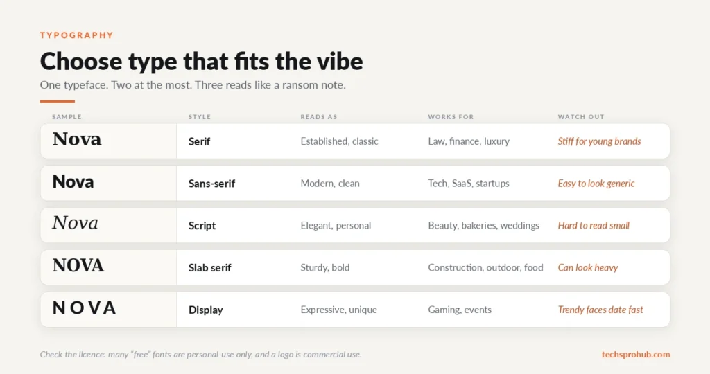
| Font style | Usually reads as | Works for | Watch out for |
|---|---|---|---|
| Serif | Established, classic | Law, finance, luxury | Can feel stiff for young brands |
| Sans-serif | Modern, clean | Tech, SaaS, startups | Easy to look generic |
| Script | Elegant, personal | Beauty, bakeries, weddings | Hard to read small |
| Slab serif | Sturdy, bold | Construction, outdoor, food | Can look heavy |
| Display | Expressive, unique | Gaming, events | Trendy faces date fast |
A few rules that save pain:
- One typeface, two max. Three fonts in a logo reads like a ransom note.
- Verify the license. Many “free” fonts are free only for personal use, and your logo uses them commercially.
- Kern by hand. Default letter spacing is built for body text, so tighten gaps like “AV” or “LT” to make a wordmark look pro.
Choose Colors With Intent
Color is what stays, so your color palette is one of your most significant decisions.
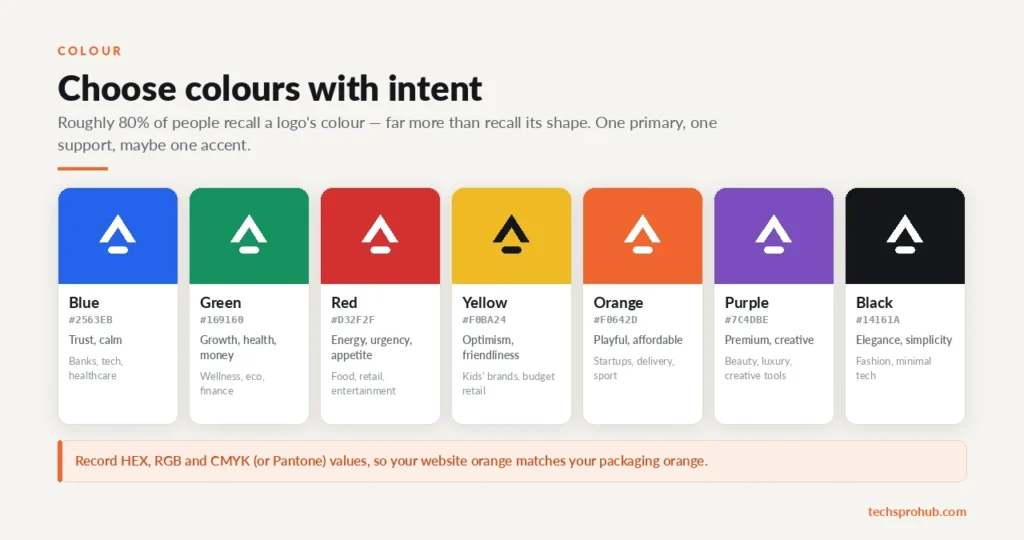
| Color | Common associations | Often used by |
|---|---|---|
| Blue | Trust, calm | Banks, tech, healthcare |
| Green | Growth, health, money | Wellness, eco, finance |
| Red | Energy, urgency, appetite | Food, retail, entertainment |
| Yellow | Optimism, friendliness | Kids’ brands, budget retail |
| Orange | Playful, affordable | Startups, delivery, sports |
| Purple | Premium, creative | Beauty, luxury, creative tools |
| Black / white | Elegance, simplicity | Fashion, minimal tech |
Stick to one primary color, one supporting color, and maybe one accent. If every rival is blue, go for bold orange and take over the shelf. Look at culture as well: in India, white is traditionally worn at Hindu funerals, while in many Western markets, it stands for freshness and simplicity. Note down precise HEX, RGB, and CMYK (or Pantone) values, so your website orange echoes your package orange.
Use Negative Space Carefully
Negative space is the open space that exists inside and around your shapes. In the hands of a skilled designer, it can enable a logo to carry two messages with no clutter. The most famous example is the FedEx logo, in which a forward arrow can be found between the E and the x.
But don’t overdo it. An inelegant trick is worse than simply having a minimal logo. And allow for some breathing space around the logo equal to approximately one letter high all around.
I Stress-Test Every Logo Like This
Build the final version as a vector. Vector edges remain crisp and clear from favicon to billboard, whereas pixelated JPGs and PNGs blur when scaled up.
Then run three tests:
- Black and white: Clear black on white, then clear white on black. If it falls apart without color, the gradient was doing the work, not the shapes.
- Scale: Test the logo at everything from a favicon to large-format printing. Details that look great on a desktop screen can disappear when the mark shrinks to a tiny icon. Google’s favicon guidelines ask for a square icon and recommend going larger than 48×48px.
- Backgrounds: White, black, your brand color, a busy photo, a circle crop. Many social platforms crop avatars into circles, and square logos lose their corners there.
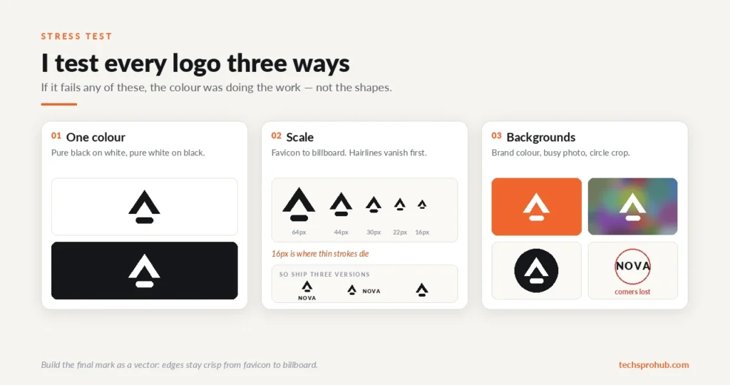
When I checked my own marks, thin strokes were the first thing to vanish at small sizes. That’s why most brands run responsive versions: a full combo mark for headings, a narrow horizontal version, and an icon-only favicon. Include reversed and one-color options for dark backgrounds and printing.
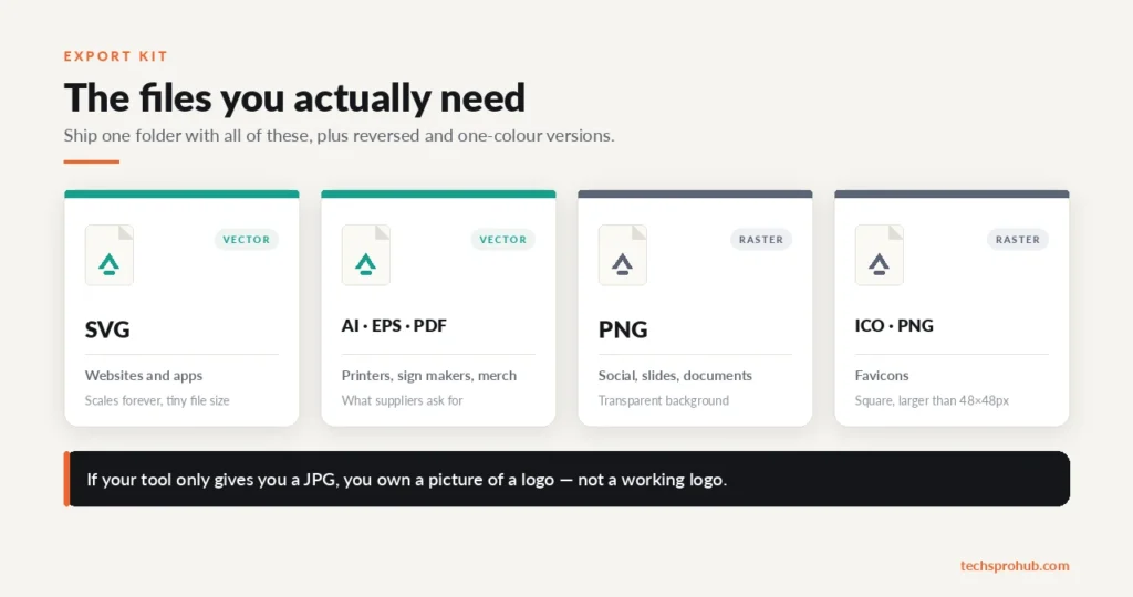
| File | Type | Use it for |
|---|---|---|
| SVG | Vector | Websites and apps |
| AI / EPS / PDF | Vector | Printers, sign makers, merch suppliers |
| Transparent PNG | Raster | Social media, slides, documents |
| Square PNG / ICO | Raster | Favicons |
If the tool that you use only gives you a JPG, you own a picture of a logo and not a working logo.
Avoid Logo Design Mistakes That Cost You Later
Most bad logos aren’t ugly. They’re impractical. For the full list, see our breakdown of common logo design mistakes.
- Skipping the trademark search. Before you print anything, check the USPTO Trademark Search, the WIPO Global Brand Database, and IP India’s public search.
- Using stock icons or clip art. Anyone can use the same icon, and it’s hard to register a trademark built on one.
- Shipping raw AI output. The US Copyright Office’s 2025 AI report says prompts alone don’t make you the author, though human edits and arrangements can earn protection. Treat the output as an idea but work on it manually.
- Asking only friends. Your mum will adore it. Ask genuine individuals from your intended market.
Logo Design Tools Worth Using in 2026
| Tool | Skill level | Best for | Heads-up |
|---|---|---|---|
| Canva | Beginner | Fast, template-based logos | Templates are shared, so customize heavily |
| Looka / Wix logo makers | Beginner | Quick AI concepts | Output often looks generic |
| Affinity (by Canva) | Intermediate | Pro vector tools, now free | Fewer tutorials than Illustrator |
| Adobe Illustrator | Intermediate to pro | Industry-standard vector work | Subscription cost, learning curve |
| Inkscape | Intermediate | Free, open-source vector editing | Interface feels dated |
| Pen and paper | Everyone | Sketching concepts | Free and underrated |
The big 2026 shift is Affinity. Canva relaunched it as an entirely free app in late 2025, and I realized that it at last puts professional vector tools within the reach of any side-hustler. On a tight budget? Here’s how to make free logos for your business.
DIY or Hire a Logo Designer?
If you’re pre-revenue, a thoughtful DIY logo that follows these steps is okay. If you’re paying for packaging, signage, or building a brand you want to scale, a professional earns their fee. Hand them your brief and expect a number of concepts.
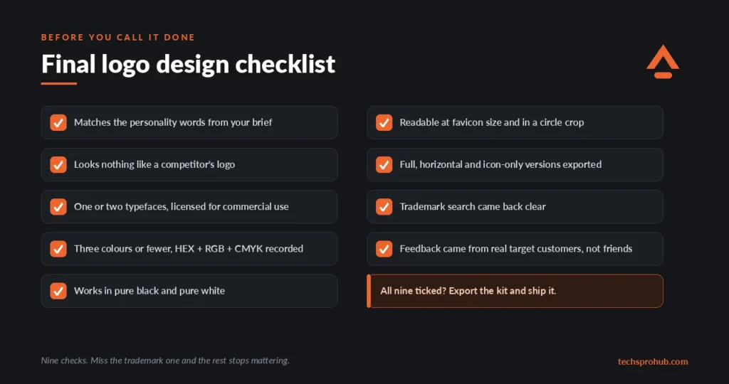
Final Logo Design Checklist
Run through this before you call it done:
- Matches the personality words from your brief
- Doesn’t resemble any competitor’s logo
- One or two typefaces, both licensed for commercial use
- Three colors or fewer, with HEX, RGB and CMYK values recorded
- Works in pure black and pure white
- Readable at favicon size and in a circle crop
- Full, horizontal and icon-only versions exported
- Trademark search came back clear
- Feedback came from real target customers
FAQs
How much time does it take to design a logo?
A template-based DIY logo can take an afternoon. The full process, from research to testing, usually takes a few days to a couple of weeks.
Can you design a logo free of charge?
Yes. Pen and paper plus a free vector editor like Inkscape or Affinity cover the whole process. Make sure the license allows commercial work.
How many colors should a logo have?
Between 1 and 3. The fewer colors used, the easier it will be to remember, the cheaper it is to print, and the less complicated it is to reproduce.
Do I need to register a trademark for my logo?
You don’t need to register to use a logo, but it makes stopping copycats much easier. Always do at least a preliminary check of the trademark registries pre-launch.
Wrapping Up
A lasting logo comes down to a clear brief, the right logo type, lots of sketches, ruthless simplicity, and hard testing in black and white, at tiny sizes and on real backgrounds.
What are you currently designing a logo for? Leave your current dilemma in the comments.