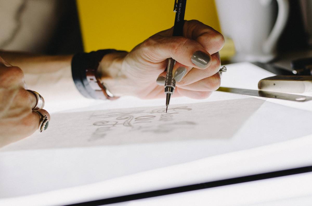

When we talk about logos for businesses and brands, people start thinking of complicated lines and clashing texts and just too many color palettes. However, nobody stops to think about the bare minimum use of things to create a logo design.
For instance, look at the logos of Microsoft, Apple, Facebook, Twitter, and Youtube. These are some big names that are earning billions but have simple logos.
Today, we are here to discuss minimalistic logo design. We believe that in the new digital era, people overthink when it comes down to logo designing.
What Is Minimalistic Design?
Minimalism design refers to the minimum use of elements to showcase your goals in your logo. A minimalistic design follows the “less is more” approach to ensure a clean and aesthetic design.
Today people are connected to digital media most of the time. This has made the whole colorful and extra line design concept fairly common for all people. Hence, people want to see something cleaner and less vibrant. Furthermore, a minimalist logo is easy to process and comprehend by the brain.
Important Things To Know About Minimalism In Logo Design
Minimalism and logo design go hand in hand. Logos are small, so you don’t want to have too much going on to cause confusion regarding what your business does. If you have too many elements in your logo it’s easy for your brand’s message to become distorted.
However, if you can understand the concept of minimalism, you will be able to balance the combination between simplicity and nuance.
Here are a few important things you should know about the minimalistic logo.
1. Flat And Monoline Forms
Flat logos are dominating the logo graphic industries these days. And the reason for that is very simple: 2D images are easily mass-produced without any hassle. Instead of using fancy graphics, flat logos can cleverly use the spaces available to create a dramatic impact.
Monolines are just the branch of two-dimensional images. It is all about the simple use of lines, making patterns for the logos.
2. Use Of Geometrical Shapes
Whether we talk about branding techniques or logo designs, we never think straight. Instead, we always look at the complex things for the solution, forgetting that even the simple geometrical shapes can get the job done.
Brands such as Windows, Target, and Audi have used basic geometrical shapes to create their logo. And we all know that the finished logo is clean, distinctive, and memorable.
3. Simple Color Palettes
A minimalistic logo can be both bright or dark, but you will hardly see any overlapping colors. The color scheme of a minimalistic logo uses two different colors or three at most. This ensures the logo looks clean, neat, and comfortable to the eyes.
4. Nuanced Imagery
If you look at the business standpoint, nuance is at the core of minimalism. The modern designer takes pride in surprising others with simplified art. A logo created with the integration of nuance is easily recognizable, and customers never get confused with other brand’s logos.
5. Simple Use Of Text
If you really want to read the epitome of minimalism, nothing can beat the use of text alone as a logo. This is because text-based logos command attention from the moment they are in view and are very clear about the meaning.
How Minimalism Affects Logo Design?
Do you know what is so attractive about minimalism? Although it is evolving, the core aspect remains the same. The elements that were common for minimalism for decades are the same for today. These include:
- Clean lines.
- Elementary shapes.
- Simple use of colors.
- Simple text.
- Least amount of ornamentation.
The core benefit of using minimalist logo design is that the consumers do not have to think too much to understand the meaning. And this is what businesses and brands need.
Also read about: 7 essential characteristics that make a logo design memorable