Building apps for the iOS platform has always the distinction of more sophistication, clarity, and ease of use than other OS platforms. No wonder, in respect of smooth and seamless user interface (UI) design, iOS always creates benchmarks that others follow. This is also the reason why for any new business or startup creating an iPhone app with a stand-out UI remains always a challenge.
When it comes to the scenario of startup app development in Dublin or other Irish cities, iOS apps enjoy more patronage and preference than other platforms. This is simply because startup app ideas for Irish businesses always find the sophistication of the iOS platform as the natural alley for creating their digital footprint.
As an Irish business do you want to know in more detail about creating impressive iOS apps that easily stand apart from the rest? Here we provide a brief guide for the same.
Create a great app wireframe
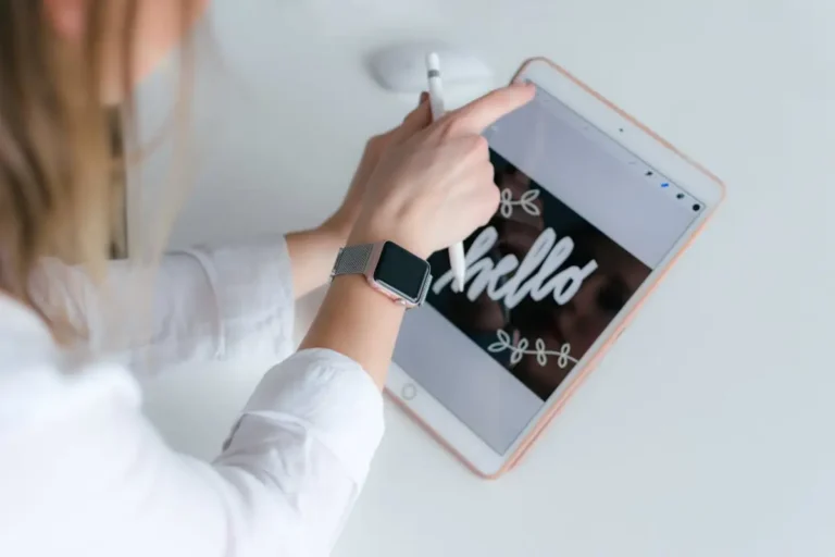
In iOS app design both the user experience (UX) design and user interface (UI) design play a mutually important role in shaping the overall user engagement potential of the app. Both of these aspects can be shaped by putting the style and visual elements in perfect proportion. This design endeavour starts with app wireframing.
The wireframe representing the simple sketch outlines of an app concept helps you to focus on the flows of the app instead of the visual details such as colour, fonts, etc. The wireframes are designed by using layouts elements such as shapes and boxes. You can create wireframes by simply using pen and paper or by using wireframing tools such as Illustrator or Balsamiq.
The wireframe of an iOS app will typically show how various app features will fit in and how users can navigate from one app screen to the other with ease. As the primary focus, just give all your attention to creating a clean and easy-to-use app design with intuitive navigation. You can focus on style elements only after this basic UI layout is finalized.
KleverApps has distinguished itself as one of the most sought-after mobile UI/UX design companies. When it comes to app development in Ireland by KleverApps, irrespective of your business niche you can be assured of delivering the most sophisticated user interface and user experience to iOS users.
Use tap targets easy for fingers
Having the easy and finger-tap-friendly tap targets is another crucial design consideration that you need to focus upon. As a principle, focus on making the tappable button area bigger to ensure easy finger taps and pointing accuracy. Follow Apple’s recommendation of creating tap targets with at least 44x44px dimension for smooth interaction.
When buttons are appropriately sized without really being as big as to cause visual distractions, this will prevent users from having a frustrating experience of tapping multiple times for interacting with the target buttons and links. Another crucial thing to take care of is to ensure enough distance from one button to another for easy visibility and smooth tap interactions.
Let the design follow a key goal for every screen
For every app screen, make sure the design follows a particular goal or what you should help users to accomplish from that app screen. For instance, a video streaming app on the opening screen can show contents that users prefer or the ones users frequently view.
The designer has to decide the primary objective that an app should help users to accomplish from each screen. In an email app, the first screen is there to show all the received emails and open conversations. The designer accordingly should prioritize the design of this screen following this goal.
Choose the right colour scheme
The designers should fully follow the colour principles and colour philosophy for the design of every app screen. The chosen colours and how they are used coherently make a crucial aspect of the User Interface (UI) design. The Human Interface Guidelines (HIG) of Apple suggests limiting the colour scheme within the colour choices used for the brand logo.
On the other hand, make sure that the colours intuitively are suggestive of actions to engage users more intuitively. Using colours appropriately in coherence with the UI design easily can help users see various parts and components of an app interface. Appropriate use of contrast is also important to ensure coherence and balance in the app UI design.
Lastly, make sure that your colour scheme perfectly adapts to the light mode and dark mode screen appearances. Since not all colour schemes may look equally great in light and dark mode, you need to create two different colour schemes for two of these modes.
Make use of iOS-specific typefaces
Though there are hardly any stringent rules for using the typography, the Human Interface Guidelines (HIG) of Apple mostly recommends the designers to use two widely acclaimed iOS typefaces such as San Francisco and New York. Apple with years of research and designer inputs designed these typefaces with both scalability and adaptability in mind.
This doesn’t mean that different typefaces other than these two recommended ones cannot be used for iOS app design. But these two typefaces have been proven to be highly effective in representing a brand in a visually vibrant and more sophisticated manner.
One should also keep in mind the befitting use cases and scenarios for using these two typefaces in the app design. For example, in-text paragraphs and functional texts used for clickable instructions, menu or navigation buttons both San Francisco and New York typefaces come as the appropriate choices.
As for differentiating the use of fonts as per contextual uses, one has several different options within the San Francisco font family. The New York serif font of Apple mostly suits the app titles and H2 texts.
Utilise iOS gestures and haptics
If it is not necessary for your app project, try not to mess with the default gestures provided at the edge of any iOS device. Since these gestures allow interactions with the device Home Screen, Notification Centre, app switcher and Control Centre are crucial to delivering a sophisticated user experience, it is better to keep them as they are.
Secondly, always follow the standard rules of using iOS gestures for completing various tasks. Since app users are already familiar with these standard gestures across a variety of iOS devices, changing them can create confusion.
You should also make use of standard haptics for gestures provided by iOS apps. For example, the haptic feedback when reverting to the Home Screen or scrolling the sidebars should be utilised to the optimum advantage of the sophisticated app user experience and smooth user interface.
Conclusion
Let us admit that designing a great iPhone app involves expertise with several key UI and UX design elements. The design elements should be conceptualised and put into practice for allowing the users to fulfil their goals from every app screen. The design elements should offer enough breathing space by limiting cognitive loads and visual distractions to a minimum.
Read more: Why A Business App in the iOS Platform Important?